Civilized Wine
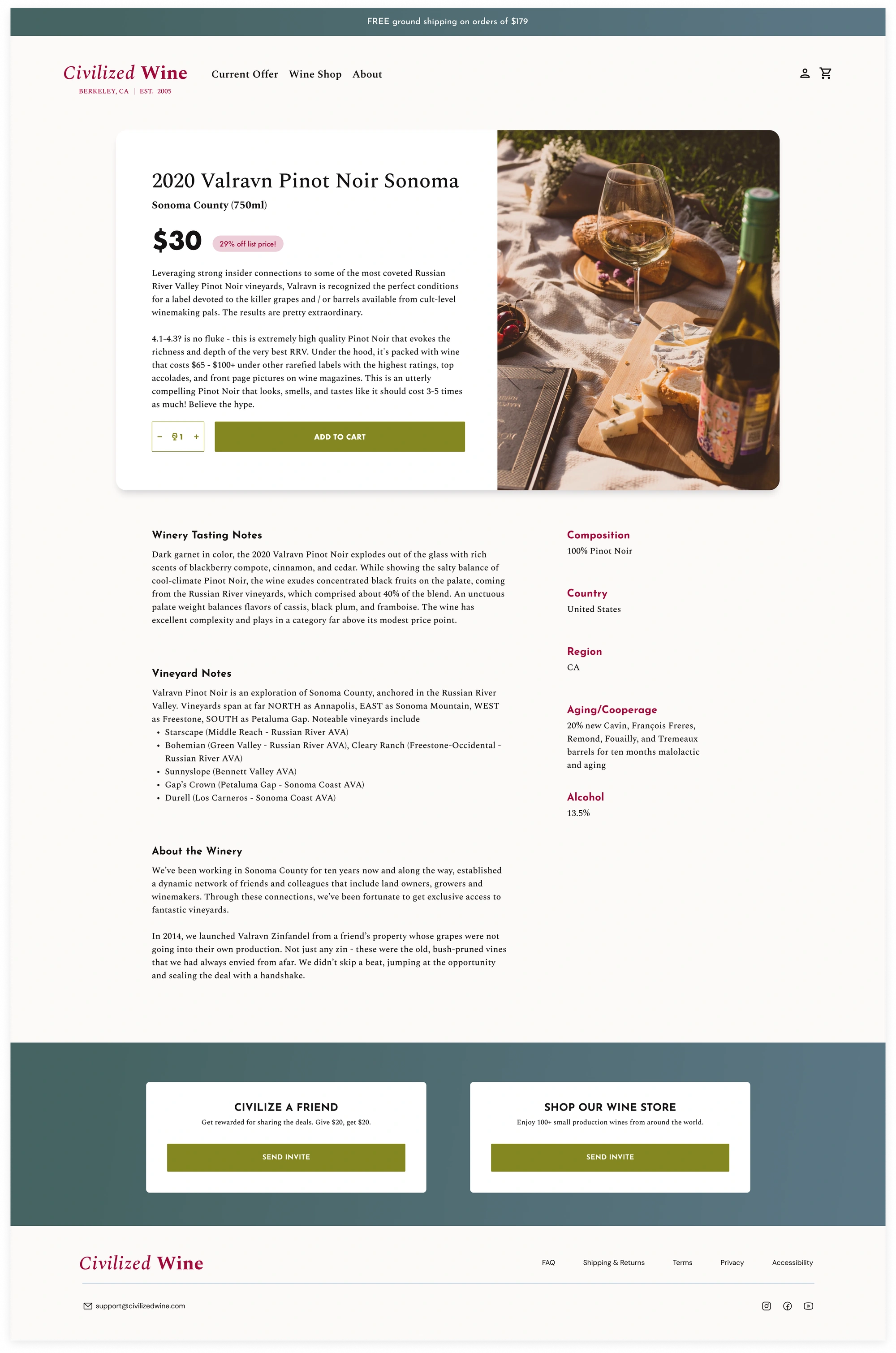
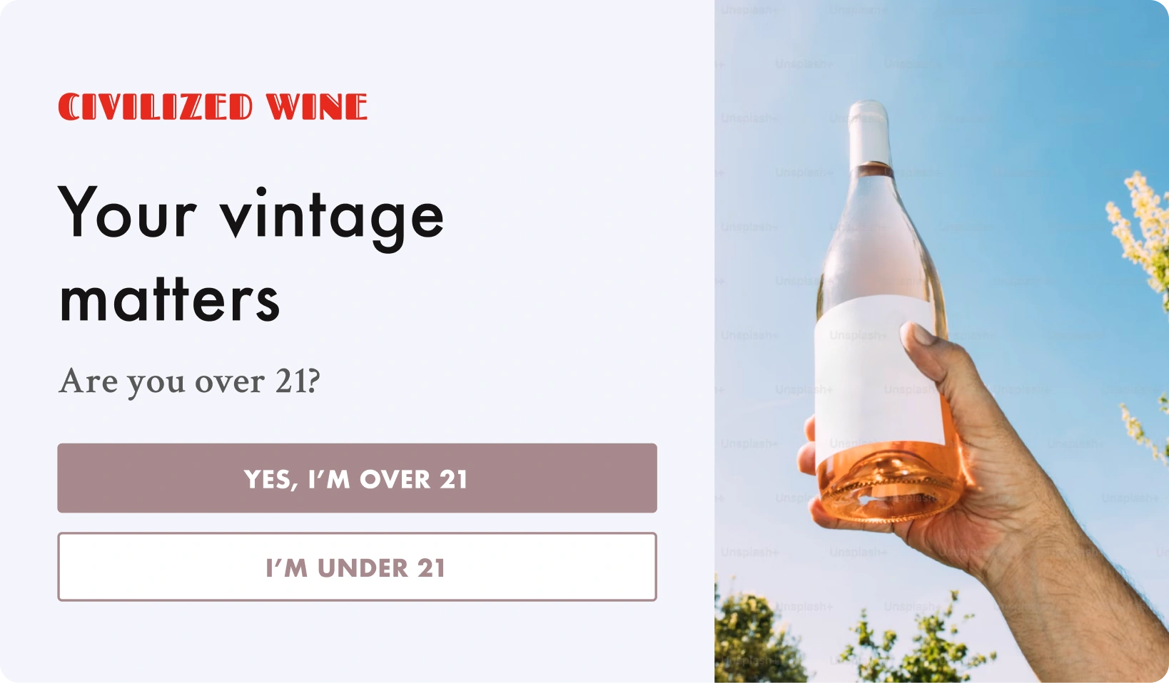
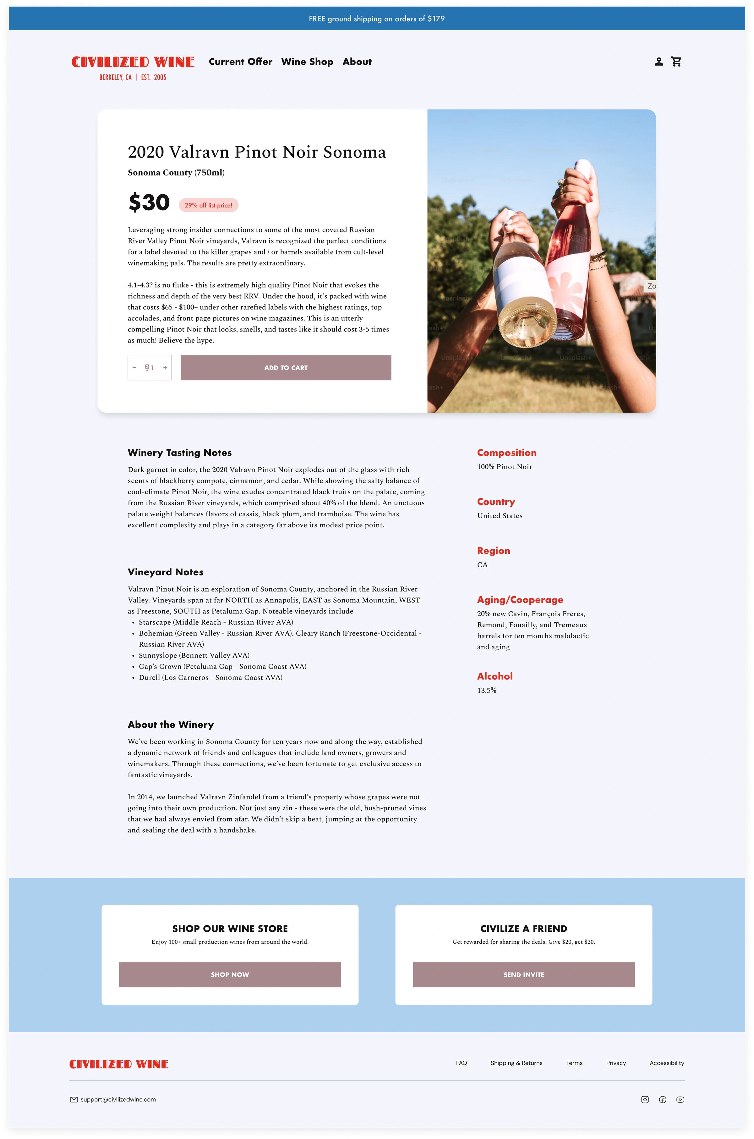
Two branding directions for Civilized Wine, an independent wine shop. We went with Grounded & inviting, bringing a warm, neighborhood feel to the online shop.
Bold & playful
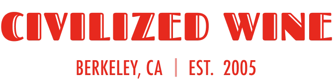
Punchy red lettering, oversized type, and cool lilac give this direction cool energy. Curious, a little irreverent, and always up for opening something new. Consider it permission to pick the bottle with the weird label.
Grounded & inviting
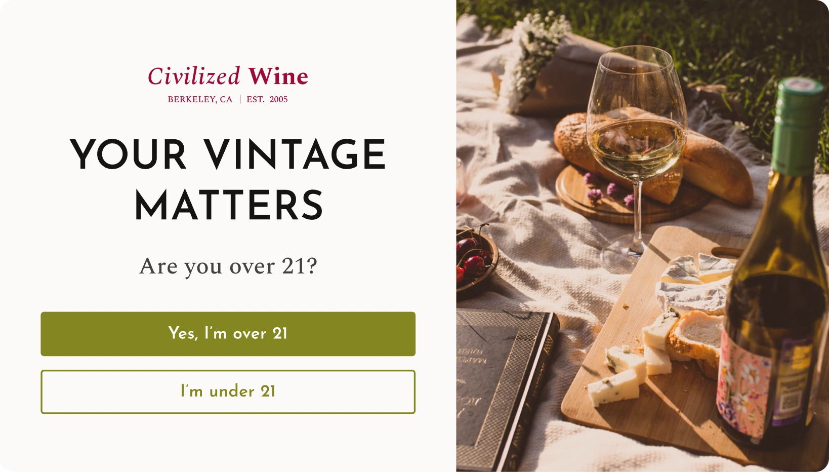
Warm neutrals, burgundy serif type, and olive green feel like a neighborhood shop with very good taste. Thoughtful, unhurried, and easy to get comfortable with. The kind of place you visit for one bottle and leave with dinner plans.